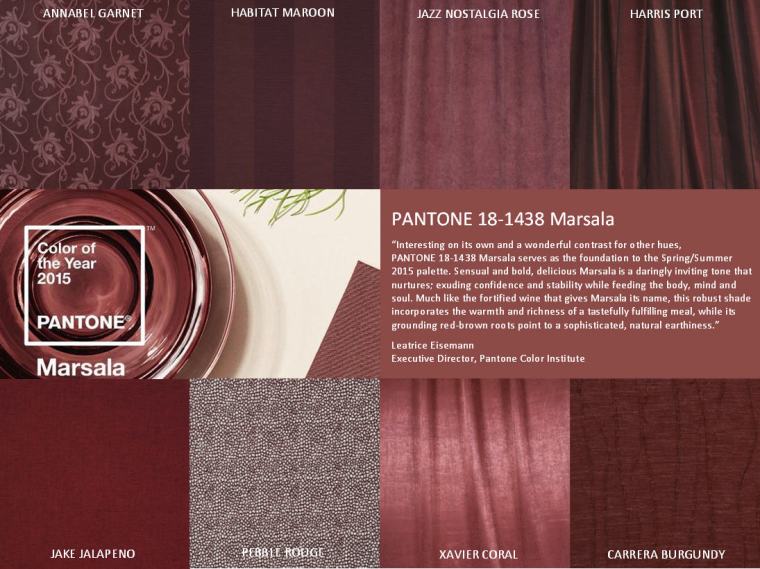
1963. A man named Lawrence Herbert, has created an innovative system of color identification. For what? As consumers, we are not aware environments Pantone colors. Is it in the production of clothing, or when watching commercials that encourage us to buy the product presented. Here is one of the millions of examples of how important it is to choose the appropriate color in the fashion industry. Imagine a situation in which the designer, draws his design on paper, fills it with color, scans or takes a picture of the project and sends … say to China, in order to produce his new collection. It turns out that the colors used by the designer, are different from the colors on the screen, and these again are different from the color of selected fabrics for the production of clothes. The best thing would personally go to the factory and make sure it all by yourself, to make sure that the production of the new collection will be used exactly the colors that the designer wanted to include. Yes, but who would have the time, desire or money? Fortunately, 50 years ago, came up with the brilliant idea Pantone- founder Lawrence Herbert, creating a system of color identification. From that moment, everything changed. Each color has been subordinated to both the name and unique number. Fashion houses, designers, factorys, or subcontractors, start to used the color identification system based on Herbert. Now imagine the same situation after 1963. The same designer, drew the same project, using the same color, but the color in your design, used crayons Pantone. What has changed? He knew exactly what colors he used. Along with the project, sent the attached list of colors based on the Pantone system. Subcontractor of the project, using the color picker identifies them and selects fabrics that perfectly remaps the color picker, or dyed fabric for exactly the same color. So that misunderstandings go into oblivion. Less confusion, stress. In return for peace and full satisfaction. My example above, by virtue of the exercise of my profession, is typically based on the fashion industry. However, it concerns many industry nowadays. Interior design, computer graphics, advertising, architecture, painting, cosmetics and make-up. Since 2000. Pantone company each year selects and announces a new color, the color of the year. This year we chose the color Marsala 18-1438. So burgundy color, which I’m obsessed with for 2 years!
 ![]() Perfectly interacts with grays, black or neutral browns. To create a contrast, perfectly harmonizes with the yellow, purple or turquoise. For the full Pantone colour range visit : http://www.source-werbeartikel.com/PANTONE/
Perfectly interacts with grays, black or neutral browns. To create a contrast, perfectly harmonizes with the yellow, purple or turquoise. For the full Pantone colour range visit : http://www.source-werbeartikel.com/PANTONE/
 1963r. Niejaki Lawrence Herbert, stworzył innowacyjny system identyfikacji kolorów. Po co? Na co? Do czego? Jako konsumenci, nie jesteśmy świadomi otoczenia kolorami Pantone. Czy to przy produkcji ubrań, czy przy oglądaniu reklam, zachęcających nas do kupna prezentowanego produktu. Oto jeden z milionów przykładów, jak ważne jest odpowiednie dobranie koloru w branży modowej. Wyobraźcie sobie sytuację w której projektant, rysuje swój projekt na kartce, wypełnia go kolorami, skanuje lub robi zdjęcie tego projektu i wysyła… powiedzmy do Chin, w celu produkcji jego nowej kolekcji. Okazuje się, że kolory użyte przez projektanta, różnią się od kolorów widocznych na ekranie, a te znów, różnią się od kolorów wybranych tkanin do produkcji ubrań. Najlepiej byłoby osobiście wybrać się do fabryki i dopilnować tego wszystkiego samemu, aby mieć pewność, że do produkcji nowej kolekcji, zostaną użyte dokładnie te kolory, które projektant chciał uwzględnić. Tak, tylko kto by miał na to czas, chęci czy pieniądze? Na szczęście 50 lat temu, na genialny pomysł wpadł założyciel Pantone- Lawrence Herbert, tworząc system identyfikacji kolorów. Od tego momentu wszystko się zmieniło. Każdy kolor, został podporządkowany zarówno nazwą, jak i unikalnym numerem. Domy mody, projektanci , fabryki, czy podwykonawcy, zaczęli posługiwać się identyfikacją koloru na podstawie systemu Herberta. Teraz wyobraźmy sobie tą samą sytuację po 1963r. Ten sam projektant, narysował ten sam projekt, używając tych samych kolorów, jednak do pokolorowania swojego projektu, użył kredek firmy Pantone. Co to zmieniło? Wiedział dokładnie, jakich kolorów użył. Wraz z projektem, wysłał załączoną listę kolorów na bazie systemu Pantone. Podwykonawca projektu, przy pomocy próbnika kolorów identyfikuje je, oraz dokonuje wyboru tkanin, które idealnie odwzoruje kolor na próbniku, bądź farbuje tkaninę na dokładnie ten sam kolor. Dzięki czemu nieporozumienia odchodzą w niepamięć. Mniej zamieszania, stresu. W zamian za to spokój i pełna satysfakcja. Mój powyższy przykład, z racji wykonywania mojego zawodu, oparty jest typowo na branży modowej. Jednak dotyczy on bardzo wielu branży w dzisiejszych czasach. Projektowanie wnętrz, grafika komputerowa, reklama, architektura, malarstwo, kosmetyka czy wizaż. Od 2000r. firma Pantone, co roku wybiera i ogłasza nowy kolor, kolorem roku. W tym roku wybór padł na kolor Marsala 18-1438. Czyli burgundowy kolor, na który choruję od 2 lat!
 ![]() Idealnie współgra z szarościami, czernią czy neutralnymi brązami. Aby stworzyć kontrast, świetnie współgra z żółcią, fioletem, czy turkusem. Jeżeli temat zainteresował cię bardziej, zajżyj tutaj po pełną listę kolorów Pantone: http://www.source-werbeartikel.com/PANTONE/
Idealnie współgra z szarościami, czernią czy neutralnymi brązami. Aby stworzyć kontrast, świetnie współgra z żółcią, fioletem, czy turkusem. Jeżeli temat zainteresował cię bardziej, zajżyj tutaj po pełną listę kolorów Pantone: http://www.source-werbeartikel.com/PANTONE/